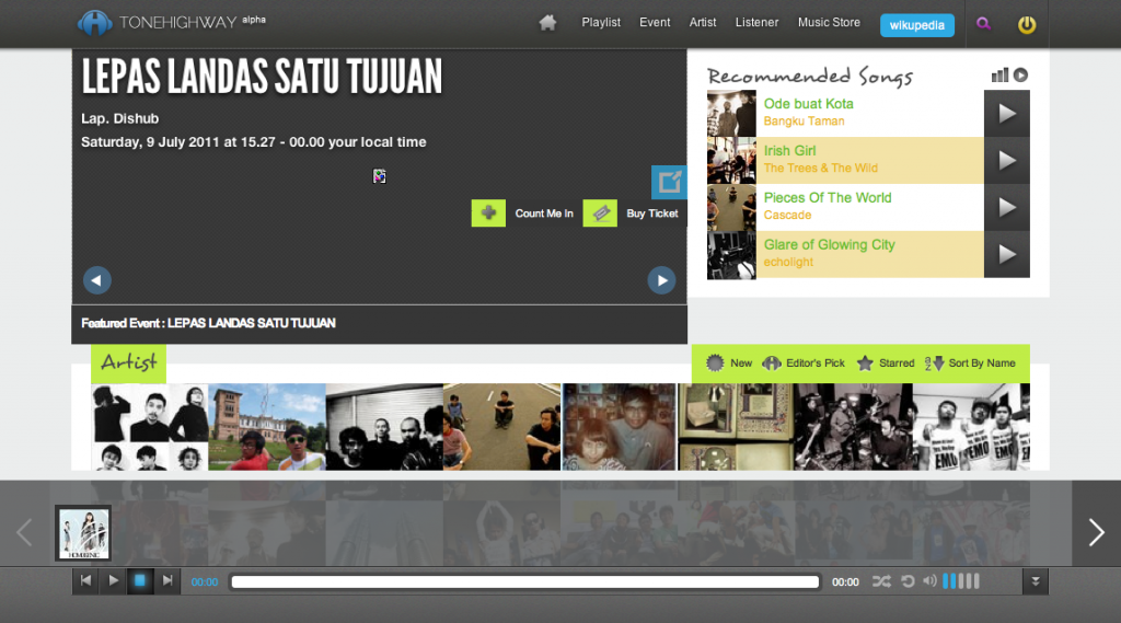
 Do you remember Tonehighway? Last time DailySocial wrote about this web based music player, is on Sepetember last year. Now they have new design and new facility. If looking at their Facebook account , they’ve applied their new design at the end of may 2011.
Tonehighway enables their user to listen to music collection (mostly sidestream music) while reading about information on the musician such as, biography, show schedule, images, etc. users can also share their favorite music to their chosen social networks.
It is a significant change because they revamped almost everything including how users can interact with their service. If previously their design was focused on being music player, now it looks more like social network with “bar” to play music on the lower side, which continuously play music while users browse about the musician’s information.
At homepage you will see a merrier looks than previous Tonehighway, here you can choose various facilities, choose artist from ther profile picture, see the last track played by other users and check list of music genre and you can also see list of the latest active users in Tonehighway.
You can directly choose your favorite artists and listen to the music available there. Music player’s design and looks is now on the lower side using “bar” with gradation effect to show song list on your playlist, so when you browse through the artist’s profile, the looks will not be a bothersome.
 You can also create playlist from various tracks in Tonehighway’s collection, of course you need to login to enjoy the facility. Other than that, there’s a queuing facility that enables you to create song list to accompany your internet activity. This could be one of the facilities I like most.
Back to homepage, you can also browse other facilities or information available on Tonehighway through menu option on the upper side, including the option to see and create playlist. Tonehighway also provide songs recommendation for their users. There’s also a social facility like recommendation, becoming fans of certain musician or ‘Like”.
I do agree with some friends, that their old looks reminded me of TheSixtyOne.com while the new one reminds me of Groveshark. Not all element, only the playlist that appears on the lower side and how they show song track. But as I’ve previously explained, Tonehighway is now more line social networks than simply a web based music player.
Interesting changes, although for me the new looks becomes too crowded, but it looks like Tonehighway is taking Indonesian market who really likes social element, where there are lots of menu options to be browsed around, not only song player as main facility.
I tried several songs myself and the quality of their music collections is quite good, far better buffer time, and as previously written in DailySocial, now you can replay one song on certain part. Unfortunately their loading (on the site not on the buffer time) is still slow and they need more musics to add. One of the facilities I am looking forward to are song download and buy. There’re buttons for that already, but can not be used yet. It will be interesting to see how their strategy in applying the facility.
Ok, go on and check Tonehighway out to try their new looks and facility, and don’t forget to leave your comment below.
Thanks Daus for the tip.
